
Nonprofits have come to realize that brand strategy and graphic design are important tools. The next step is to learn how to use them better.
We would all prefer that good ideas and deeds speak for themselves, but the fact is that perceptions make a real difference in nonprofits' ability to do good. Our visual lives are dominated by spendy, savvy commercial graphic design, with $11 billion or more spent on over 200,000 designers in 2023 alone. Our eyes expect perfection, so a misaligned webpage or gallery of grainy photographs can make even the most effective nonprofit seem dysfunctional and send people's attention and money elsewhere.
Central to the business of shaping perceptions is brand strategy and design. These disciplines evolved in the commercial sector for just one goal: to motivate customers to buy more at a higher price. In behavioral psychology terms, the aim is to increase the customer's perceived value of an outcome and the perceived efficacy of the service or product being sold. This could be something physical — "Quench Your Thirst"! Or it could be an almost spiritual exhortation — "Just Do It"! Either way, commercial brand strategy and design work to make the customer feel that they have a want and that the purchase of a product or service will fulfill that want.
Historically, nonprofits have seen brand strategy and design as natural tools for fundraising, which is relatively analogous to commercial goals. Thankfully, in recent years they've also begun to understand that brand strategy and design can be used to increase social impact. A thriving nonprofit-focused subdiscipline has emerged to meet this demand.
And yet with all of this new understanding and investment — and with legitimately talented and well-intentioned people doing the work — why is so much nonprofit design so uninspiring and predictable, if not outright damaging? Why does the very idea of "nonprofit design" conjure something different from — and less impressive than — commercial design? Is it a simple matter of "you get what you pay for" and the undeniable reality that most nonprofits have less money to spend than corporations?
In our experience, most nonprofit design misses are the result of bad brand strategy and decision-making, not a lack of resources. To illustrate this, we'll discuss three less-than-inspiring nonprofit design trends and the brand strategies we believe lead to them. To be clear, none of the individual brands we use to illustrate our points are, in our opinion, bad — but taken as a whole, they do contribute to an overall sameness that defines the field.
The first trend is what we would call "expository symbolism." Through color, iconography and other visual elements, nonprofits tell, rather than show, who they are using simplified visual cues. Picture criminal justice nonprofits, for example. What color do you see? You probably see shades of blue. We call this color family "Justice Blue."
Why blue? If a nonprofit that aims to end mass incarceration or check police violence and racism needs to be heard by system actors, then it needs to make system actors somewhat comfortable, and blue is a color traditionally associated with law enforcement. In this sense, Justice Blue is a valid design decision. But if the nonprofit also needs to partner with impacted communities, Justice Blue can raise serious concerns about the nonprofit's allegiances. From this more complicated brand strategy, we often see purple, red and black. Still, these colors are expository: Purple is a little bit outside the box, but could also express nonpartisanship; red and black are urgent and authoritative, sometimes oppositional, sometimes patriotic. All of these colors are predictable and do little to inspire audiences to open their minds to new ideas.
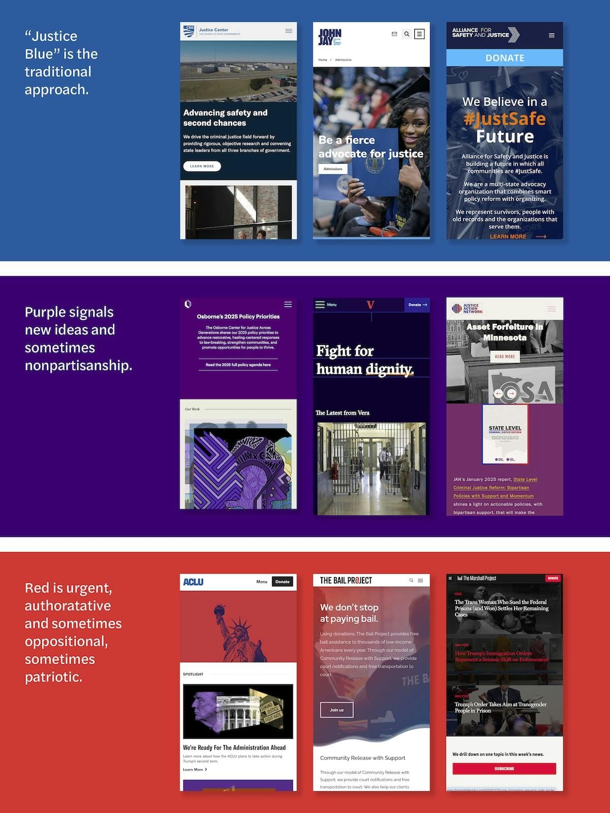
Countless other examples exist across issue areas, where certain colors, icons and types of images become lazy shorthand. From puzzle pieces for autism charities to happy protesters for racial justice organizations, expository pastiche is the default visual setting of the nonprofit sector because nonprofits too often see design as a way of saying what they do rather than eliciting perceptions of the value and efficacy of what they do.
Another bad nonprofit design trend is collage. Collage provides the opportunity to represent things not as they are, opening the viewer to what can be. As Jason Farago of The New York Times put it when discussing Juan Gris' revolutionary collage work, "The picture is no longer an act of perception. It's an act of imagination, with a life and a logic of its own." Indeed, behavioral psychology indicates that representations of aspirational states can help make those states seem more valuable and more attainable, thus increasing motivation. So collage could, theoretically, be a powerful tool in nonprofit design.
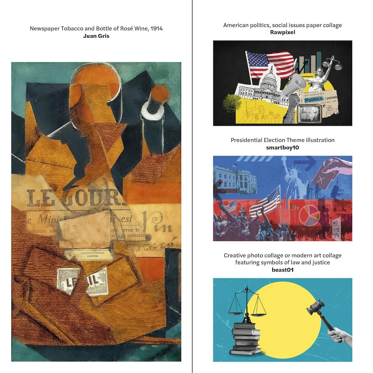
Unfortunately, the primary use of collage in the nonprofit sector these days seems to be to signify disruption through a jumble of artlessly literal and often stereotypical elements, rather than as a way to movingly represent aspirational outcomes. Take the aggressively surreal but still somehow cliché collages that pepper the Ford Foundation's website. Worse yet, the legal warriors of the ACLU of New York appear too busy protesting to do much litigating. It's as though their work were motivated by outrage rather than law, and that protest itself is the outcome they aspire to achieve.
In writing this article, we tried to find good nonprofit uses of collage, but we failed. Collage is art and good art is really hard to make. Many nonprofits are drunk on disruption and can't see that they're buying — and making us all look at — bad art, rather than investing in good, strategically precise design.
The final corrosive trend in nonprofit design is "cleanness." Many nonprofits say that they desire a "clean" visual look. What this means is very much in the eye of the beholder. In general, "cleanness" in nonprofit design is a reproduction of contemporary digital minimalism. It is a disappearing act of empty space, restrained fonts and classical geometry that in the commercial world allows products — the paramount vessel of many brands — to speak for themselves, as on this page from Nike's website.
But without colorful, comely physical products to sell — with only ideas and services and programs for social good — cleanness in nonprofit design risks being vapid. The Gates Foundation and Pivotal Ventures are aesthetically successful in their cleanness, but both leave us with little feeling for the work they do or why they do it. Cleanness as a design goal, as in, "It has to look clean," is little more than an appropriation of commercial design and leads many nonprofits to miss opportunities to create meaning through design, and in turn, to build motivation.
These three trends — expository symbolism, artless collage and cleanness — are just a few of many that make nonprofit design too predictable. That we can even generalize that something like "nonprofit design" exists, despite the hugely diverse set of goals that nonprofits have, is really quite damning. The uniformities indicate a plethora of missed opportunities to inspire, excite, and attract people to social good.
To solve this mess, nonprofits and their brand strategy and design consultants need to think and work differently.
First and foremost, nonprofits need to understand the necessity of engaging brand strategists and designers in deeper strategic conversations. Just as private sector brand strategy and design can inspire customers to self-identify with products or services, nonprofit brands can inspire audiences to self-identify with missions, motivating people to adopt and act on those missions. Done right, brand strategy and design are not a specialized subsidiary organ of marketing, communications and development, but an integral part of an organization that should interact with and influence practically every other part of an organization's work.
Brand strategists and designers, for our part, need to get smarter, more ambitious and humbler. We need to attend webinars and public convenings, buy some journal subscriptions and immerse ourselves in our clients' work. And we need to quit pretending that nonprofit goals are uniformly analogous to private sector goals and achievable by the same set of tactics.
We started this essay out with a simple premise: Good ideas and deeds do not speak for themselves. In fact, they are often hard to explain and hard to rally support behind. Nonprofits need to use every tool in the box skillfully in order to support good ideas and deeds. If the brand strategy and design tools, and skills needed, don't yet exist, then they must work to invent them. Creativity, entrepreneurship and nuanced solutions to complex problems are the hallmarks of great nonprofits. It shouldn't be a reach to extend these qualities to their brand strategy and design as well.


