A transit map designer reviews the new MTA subway map.
As a cartographer and historian, I’ve studied more transit maps than I can count. I’ve also made quite a few subway maps of my own. As such, I’m fascinated by the new subway map introduced by the MTA last week. The new map revives and rethinks a 1972 classic designed by Massimo Vignelli of Unimark International, in collaboration with Bob Noorda and Joan Charysyn. The New York Times pithily described Vignelli’s original map as “The Retro NYC Subway Map Design Nerds Love.” The Museum of Modern Art even added a copy of the map to its permanent collection.
But while design enthusiasts adored Vignelli’s map at its release, straphangers of the era hated it. The map wildly distorted the city’s geography, giving the unwary passenger the impression that Central Park is roughly a square, though the park measures two-and-a-half miles north-south and three blocks east-west. Likewise, Vignelli’s map shows Atlantic Terminal, Brooklyn, at the edge of Prospect Park. In reality, the two are nearly a mile apart. The map violently disrespected the neat Manhattan grid, showing Broadway running east-west through Midtown, and putting Second Avenue east of First. Vignelli chose to color New York’s waterways a shade of beige that evoked the color of smog, and the park system was a drab grey. None of these things generated goodwill with riders, and after public outcry, Vignelli’s map was phased out in 1979.
Its replacement, designed by John Tauranac and Michael Hertz, returned the city’s geography to the forefront. But the design community panned the Tauranac-Hertz map. In 2003, graphic design author Mark Ovenden called Tauranac and Hertz’s design “unwieldy and cluttered” in his classic book, “Metro Maps of the World.” But Tauranac and Hertz correctly captured straphangers’ mental maps of the city. Water was blue, parks were green, and the subway lines meandered their way through the city on gentle curves. (This was by design; one of Hertz’s team members, Nobuyuki Siraisi, rode every line with his eyes closed to make sure he felt the curves.) The Tauranac-Hertz map was posted in every station and subway car for four-and-a-half decades, longer than any other map to date.
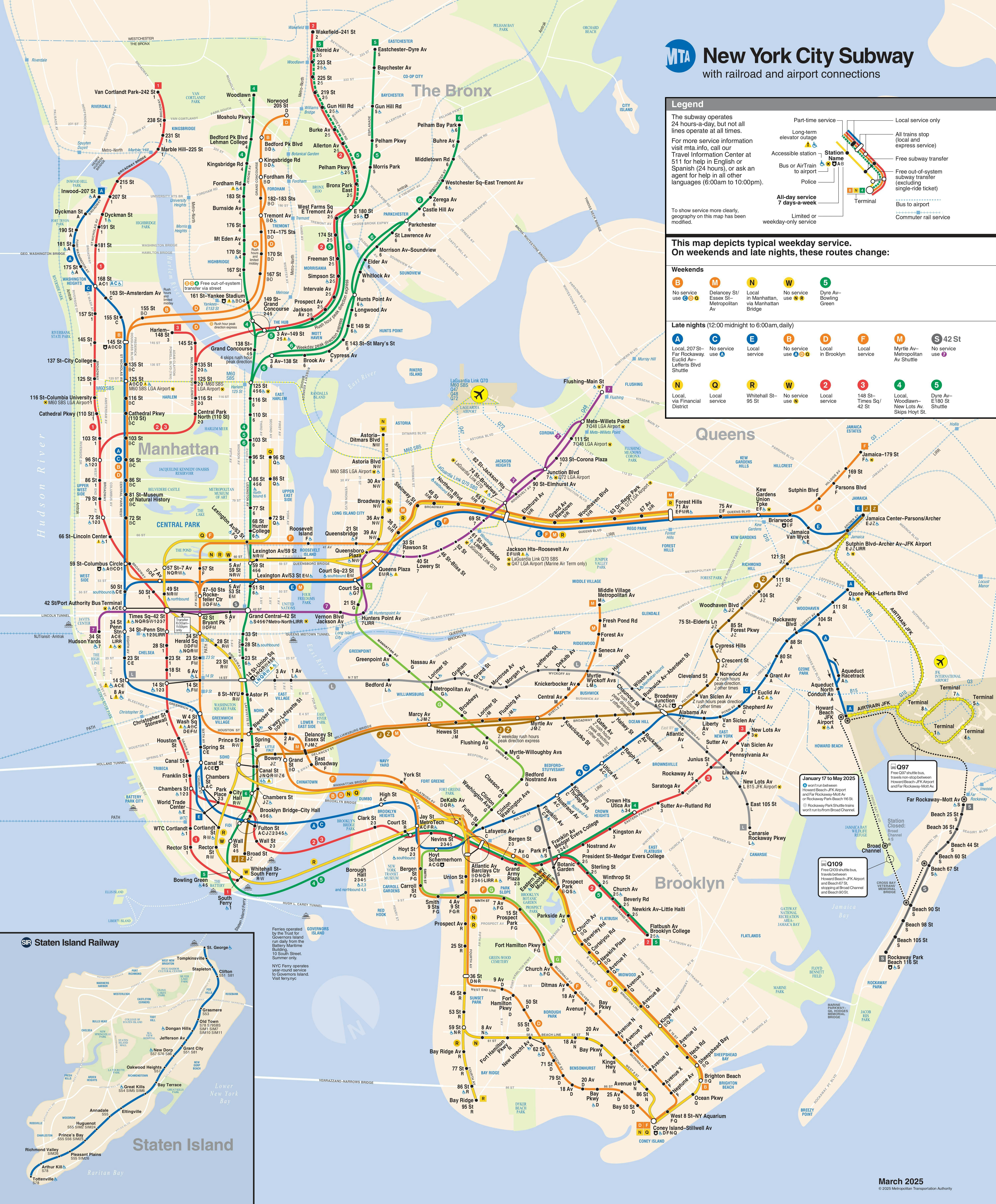
Now, the MTA has resurrected Vignelli’s map, sort of. And what they produced is a definite improvement on the Tauranac-Hertz map — with definite room for improvement. There are four key things that the new map does right, and four things that should be improved. I’ll start with what the map does well.
First, the neo-Vignelli map makes it much clearer which trains stop at which stations. The Tauranac-Hertz map uses one colored line for each Manhattan main line, relying on the user to read individual station markers to check whether the express stops there.
To understand the difference, consider the example of the 1-2-3 trains between 14th Street and Penn Station. Tauranac and Hertz condense all three routes into one line, and riders have to look at each station marker individually to see which stops where. The neo-Vignelli map uses one line for each train, using the design itself to show that the 2 and 3 skip 18th, 23rd and 28th Streets. This is a major victory for clarity, because the first task of any transit map is to get riders to their destinations.
There are four key things that the new map does right, and four things that should be improved.
Second, the MTA addressed most of the design complaints directed at the Vignelli map of the 1970s. The cheerless earth tones are gone, replaced by vivid, bright colors that reflect the vitality of the city. The MTA did well to include Staten Island, outer-borough parks and beaches on the map as well. New York is so much more than just Manhattan; by adding those landmarks, the MTA subtly encourages passengers to explore beyond the slimmest and densest borough. Additionally, the neo-Vignelli map kept one of the Tauranac-Hertz map’s best design decisions — color-coding subway routes based on their route through Manhattan — instead of having a different color for every single line.
Third, by introducing a diagram with uniform angles, the MTA has brought its design language into line with the rest of the world. For decades, the New York subway was the only major system on Earth with a geographically accurate subway map. The only other remotely comparable system that used geography as heavily was Barcelona. (Notably, like New York, the city core of Barcelona is built on an orderly grid.) This is good for visitors. That said, I’m not sure that the MTA struck the right balance between the geographical Tauranac-Hertz map and the international norm of omitting most geography. I discuss this in greater detail below.
Fourth, the release of the neo-Vignelli map was coupled with administrative changes that make navigating the weekend subway significantly easier. In addition to temporary platform signage, the MTA now puts out a continuously updated weekend map with service changes, and a live map for smartphones that overlays with Google Maps. Collectively, these things mark a major improvement from the old method of service change posters that the MTA used for decades.
That said, there are four areas where the MTA could do better.
First, there needs to be a more logical method of showing transfers. The neo-Vignelli map shows transfers in two different ways, using a lozenge-shaped bubble in some places, and a line in others. This design language is needlessly confusing. From a passenger’s perspective, both types of transfers are identical. A better way would be to distinguish between long walking transfers and short transfers, using separate icons for each.
The cheerless earth tones are gone, replaced by vivid, bright colors that reflect the vitality of the city.
I’ll give an example. If a passenger wants to transfer from the 1 train to the C train in Midtown Manhattan, both Columbus Circle and 42nd Street are valid transfer points. But the 1 train passes directly above the C train platforms at Columbus Circle, while at 42nd Street, the two lines are separated by a full avenue block. The Madrid metro map offers a way to solve this problem. The Madrid map uses different icons for short and long transfers. In the illustration, both Callao and Embajadores-Acacias are transfer points between the green and yellow lines, and the map makes it obvious that Embajadores-Acacias is more of a walk.
Second, the MTA’s way of showing connections to other systems is suboptimal. The neo-Vignelli map doesn’t make it clear when connecting transit is within a station complex. To contrast two examples: the 33rd Street PATH station is within the Herald Square station complex, and the subway and PATH turnstiles are less than a minute apart. To go from the LIRR Nostrand Avenue station to the A or C trains, it’s a three-block walk on surface streets. The neo-Vignelli map shows the two connections the exact same way. Philadelphia’s SEPTA map provides a good model for what the MTA could do: SEPTA shows when stations are connected but an additional fare is required.
The third major issue is that the neo-Vignelli map doesn’t show which lines run on the weekends. While service patterns do change on the weekends due to construction, the primary map should still attempt to show baseline weekend service. Instead, it repeats the error of the Tauranac-Hertz map, relegating weekend service to an easy-to-miss box in the corner. This is a mistake. The official map should use its design language to show that the B and W trains don’t run at all, the M train doesn’t run uptown of Delancey Street, and so on. (Ironically, the neo-Vignelli map does use its design language to show rush-hour express service.)
Fourth, the neo-Vignelli map obscures the city’s geography too much. New York’s physical geography matters more than in most cities, even in the era of Google Maps. The classic angular transit diagram, pioneered by Harry Beck in the 1930s, was created because London’s streets are a disorganized morass, the product of two millennia of organic urban development. Beck’s pioneering Tube Map brought order to London’s chaos.
For decades, the New York subway was the only major system in the world with a geographically accurate subway map.
But New York is not like London, because New York’s street grid has been master planned for centuries. The Manhattan street grid was laid out by a three-man, state-appointed commission in 1811, when the city extended only as far as Amity Street in Greenwich Village (now West 3rd Street). Because of this far-sighted decision, New Yorkers know exactly how the Manhattan core is laid out, with avenues running north-south, streets running east-west, and Broadway cutting through on a diagonal. This presents a unique challenge for a transit map designer, because the Tube Map style distorts a place’s geography to better show the train routes. This design paradigm works below 14th Street and in the outer boroughs, where the street grid is less orderly, but it breaks down above 14th Street.
Manhattan’s grid plan means that the subway map should conform to the street grid where possible, not the other way around. If there is no impediment to clarity, the zig-zags of the map should match the street grid. It is valuable, for example, to know that the 4-5-6 trains follow Park Avenue south of 42nd Street, and Lexington Avenue north of 42nd. This is something that the Tauranac-Hertz map does well, and the neo-Vignelli map does poorly.
To make an apples-to-apples comparison, looking at the Tauranac-Hertz map, one gets the basics of how the G train weaves through central Brooklyn. The neo-Vignelli map omits those useful details. In other places, the neo-Vignelli map gets the geography plain wrong, often egregiously so. Central Park is a square again. The Second Avenue F train station has somehow migrated east of the First Avenue L train station. Geographical distortions like these do little to aid the below-ground passenger, and make it harder for riders to reach their final destination once they get off the train.
All in all, I give the neo-Vignelli map a B+. It is more user-friendly than its predecessor, it corrects the most egregious design decisions of its 1972 ancestor, and many of the useful innovations from the Tauranac-Hertz map, like color-coded main lines, have stayed. The MTA’s introduction of live digital maps also helps. But there remains room for improvement. I look forward to seeing how the MTA refines its improved map in the coming years.